ELC Multi-Brand Design System
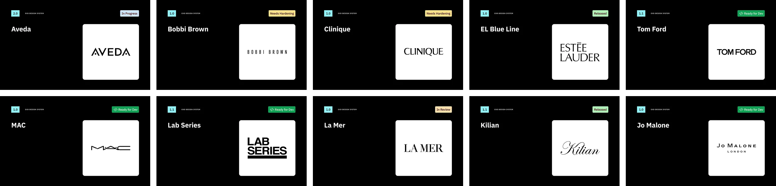
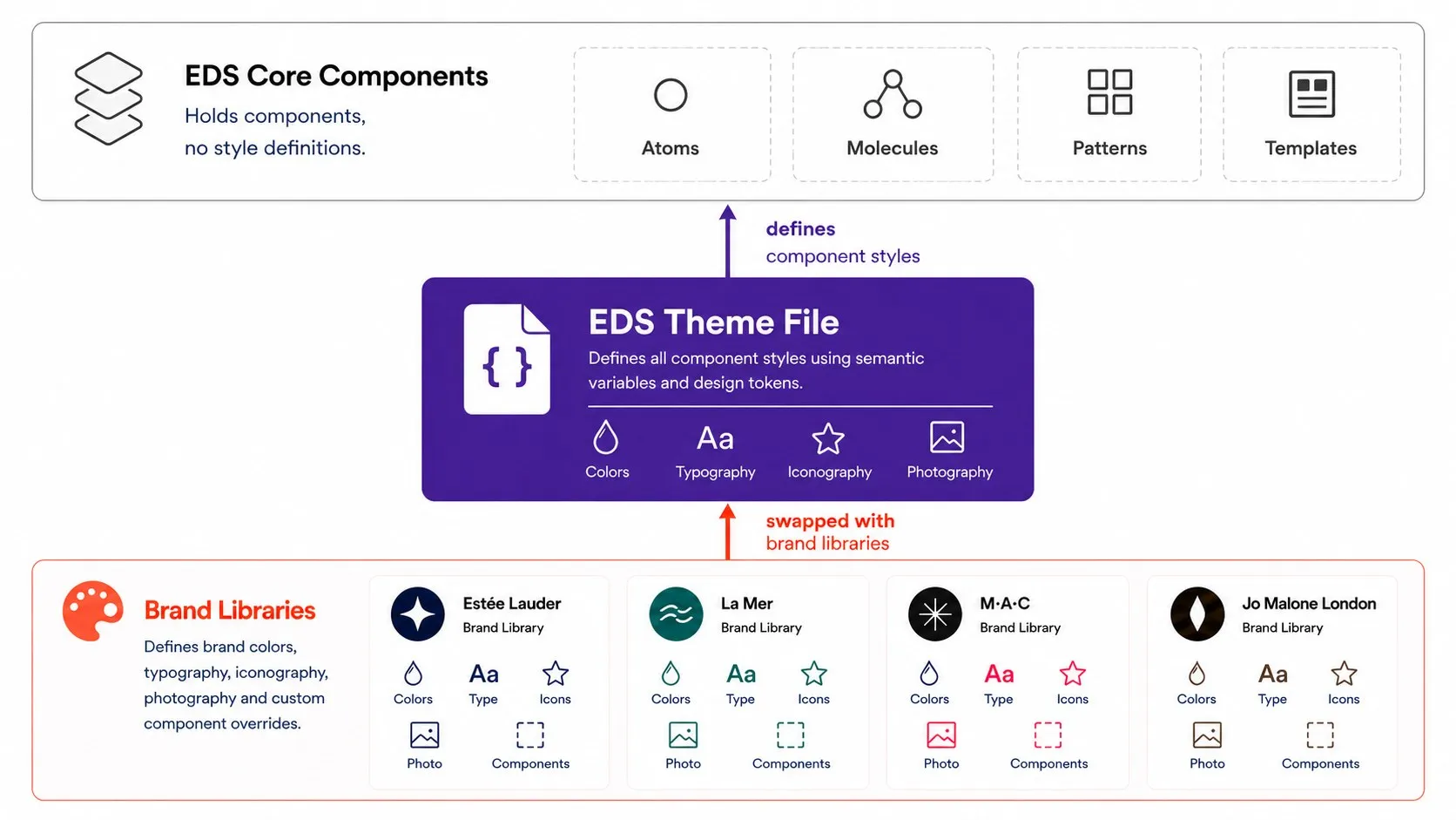
The Estée Lauder Companies run a portfolio of prestige beauty brands, and each of them has to look unlike the others while shipping on the same shared commerce platforms. The Enterprise Design System is the answer to that challenge: one component library that serves all brand websites, with a theme per brand.
As Director of the Enterprise Design System I ran the team that built and maintained it: the multi-brand theming architecture, the processes around it, the adoption program, and the roadmap for leadership.
Project goals
- A single component library that renders as any brand through theme libraries;
- Create adoption and DS support processes for consumers across the org;
- Establish a formal design systems team and ways of working with Product and Engineering;
- Envision a multi-year system roadmap and regularly report to leadership on the progress.
My role
- Director, Enterprise Design System, 2024 to 2026, leading a team of nine designers and design technologists,
- Multi-brand theme architecture: tokens & variables, typography, color, iconography, images & assets, responsiveness and themeability,
- Annual planning, resource allocation, hiring and team management, quarterly roadmaps and performance reviews,
- Contribution guidelines, triage and support protocol, brand onboarding waves, education and workshops.
- 16
- brand themes
- 262k
- component insertions
- 1.0M
- variable insertions
- 0.24%
- detach rate
- 522
- typography configurations
- ~10 min
- to theme a wire
plus one deliberately off test brand
Components v2.3, one year, 21 teams
Themes v2.4, one year, 25 teams
51 detachments in 21,000+ inserts
from four components and one token pool
down from weeks
System architecture
The library structure in multi-brand theming architectures is what makes theming practical. A single component library is paired with a white-label theme that includes typography styles, iconography, and photography assets. Brand libraries house typography styles, custom component overrides, icons, and photography. Proof of architecture ran on Figma library swap, replaced with a custom-built plugin down the line.
Tokens are managed through Token Studio and live in the repository, so any destructive actions with Figma files are easily recoverable and do not reach production directly. Sandbox files provide an environment where brand teams can explore evolutions of their brand. Another custom plugin exposes variable mappings visually for targeted updates.
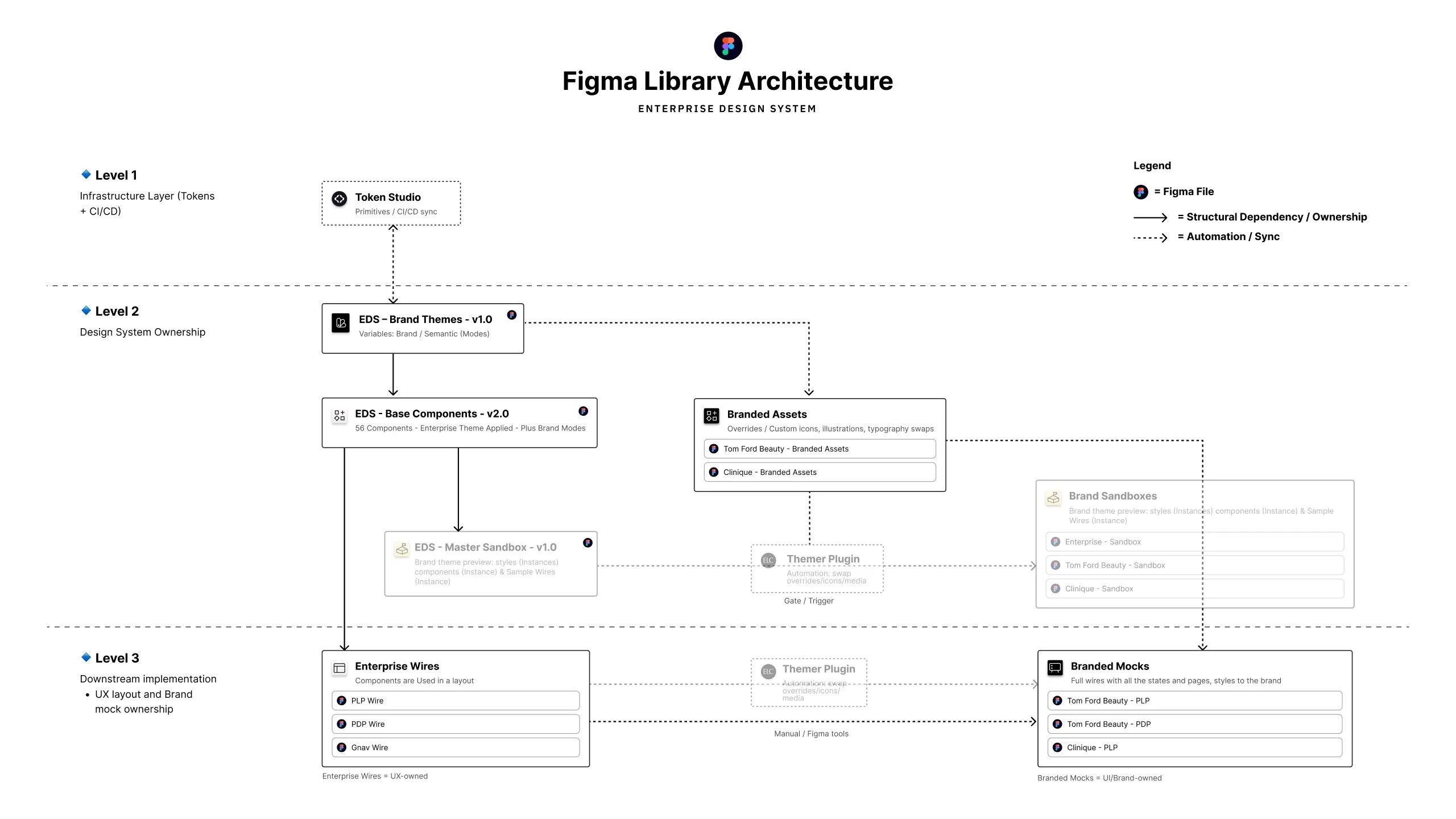
Theming architecture
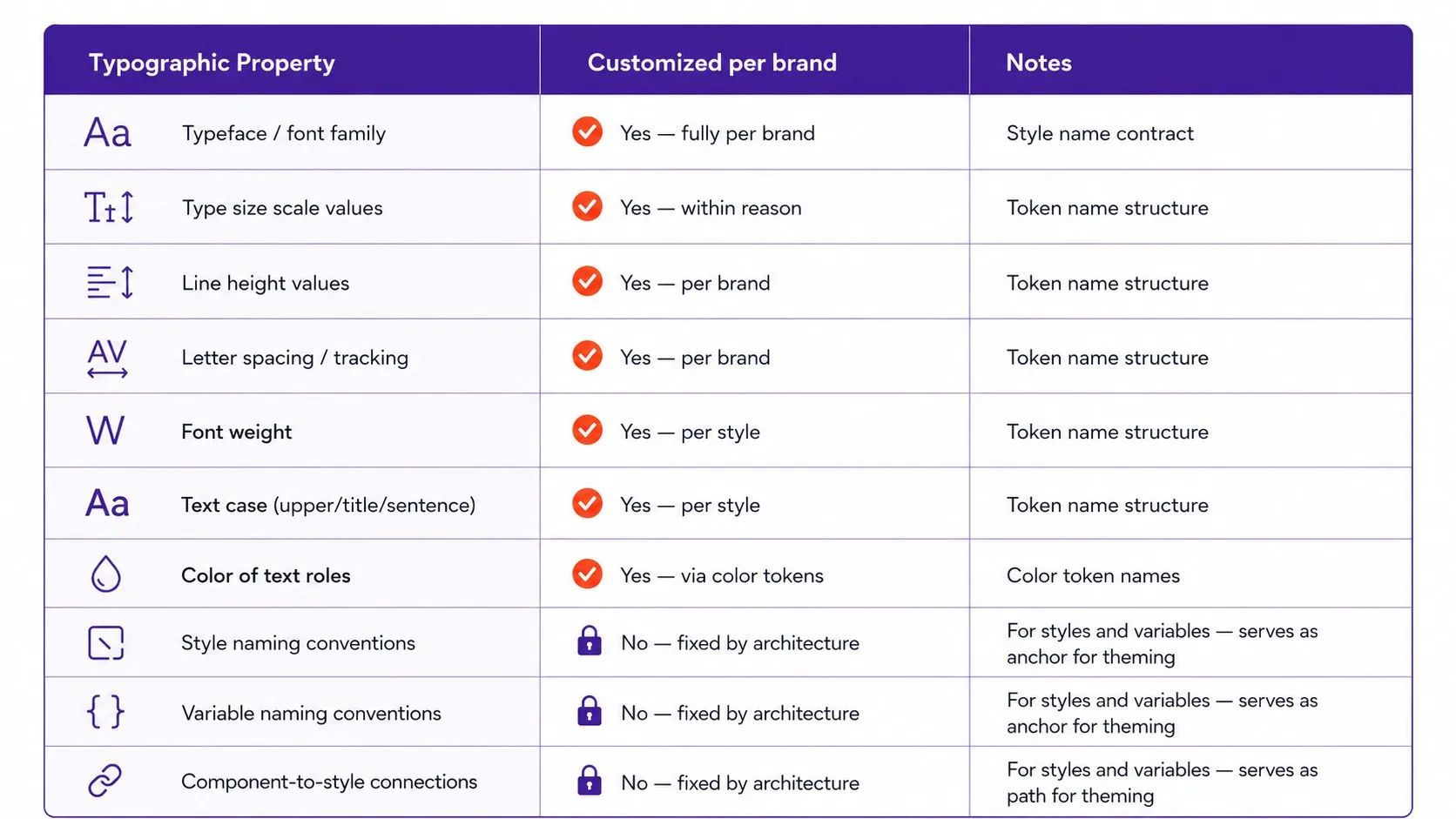
Each brand runs on four token layers: primitives, a semantic theme with light and dark modes, a responsive collection with four breakpoints, and composite typography styles. Typography turned out to be the hard part: Figma variables cannot hold case or decoration, so I made each style a recipe of seven properties, five bound to variables and two set on the style itself. Four typography components over one shared pool unlock 522 configurations, and a brand can rebind any of them without touching the pool, the components, or another brand.
Leading and growing the team
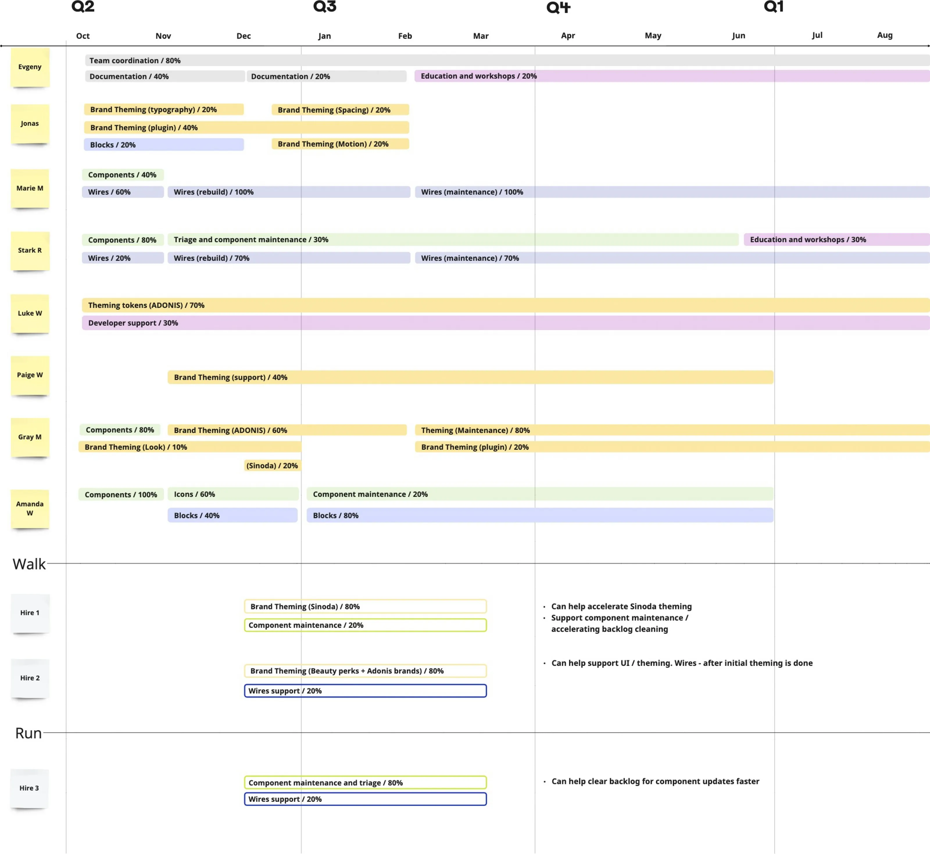
I took over a team of two designers and grew it to nine people working across theming, components, wires, blocks, and developer support, pairing up designers based on skillsets and career goals. All hiring decisions were backed up by resource allocation diagrams highlighting the gaps new hires could fill.
Each phase of the system development required modifications in the team rituals: component development was collaborative within the team, while theme development had to be collaborative across the org.
Roadmaps and leadership
The multi-year roadmap broken down into quarterly goals helped to set expectations with the leadership team early on. The teams were tasked not only to build a component library, theming, and adoption protocols but also to create reusable block patterns (composite components) as well as to rebuild Enterprise wires (full UX workflows) using new components to unlock themeability.

Adoption, by the numbers
Design System success is measured by two parameters: how often it is used and whether it's used as designed. Between 200k component inserts and over 1m variables used across 25 teams, the detachment rate stayed extremely low, ~0.24%. Established processes for maintenance requests made it easier to ask for components to be fixed rather than circumventing the system, with a 1 request per day average rate of ticket closure. As a result, theming a large Enterprise wire went from weeks to around 10 minutes with 80 to 95% coverage.
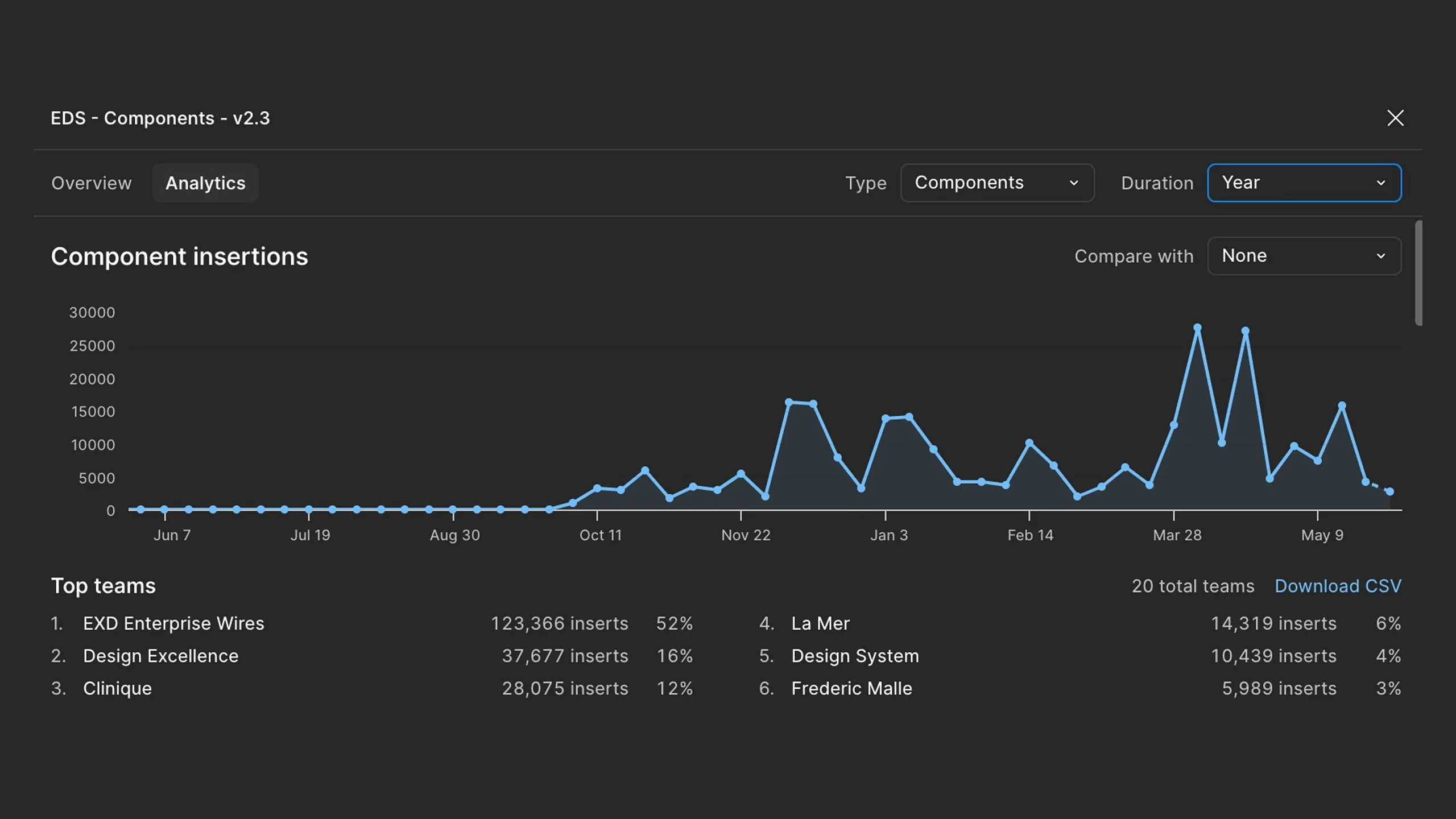
Work done at The Estée Lauder Companies. Figures are from Figma library analytics and internal planning documents; the brand-level usage shown is limited to public brands.